Playbooks
How to structure an advertorial that earns the click to your product page
A section-by-section blueprint for advertorials: the editorial frame, the problem, the discovery, the proof and the soft handoff — plus the mistakes that make readers bounce.
An advertorial is a sales argument that borrows the shape of an article. Readers arrive from a social feed in browsing mode, not buying mode. If the first screen looks like a shop, they leave. If it looks like something worth reading, they give you thirty seconds — and the structure below is how you use them.
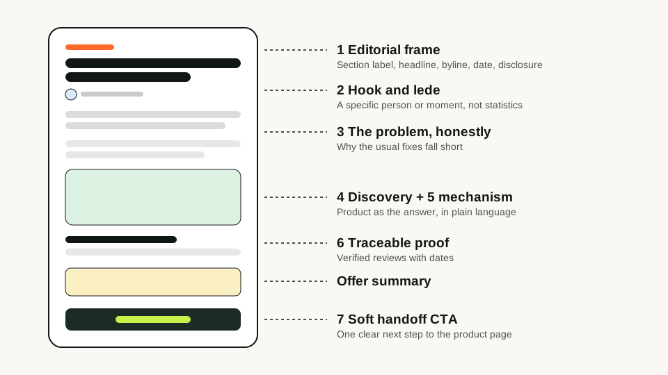
1. The editorial frame
The page header should look like a publication: a section label, a headline, a byline and a date. This is not deception — you must still label the page as advertising — but it signals that the reader is about to get information rather than a pitch.
2. Hook and lede
The headline promises a story; the first two sentences must deliver a reason to keep going. Strong ledes name a specific person or situation and an observable frustration. Weak ledes open with the product or with generic statistics.
- Specific over general: “three alarms and still late” beats “many people struggle with mornings”.
- Tension in the first paragraph: something is wrong, and the usual fixes did not help.
- No product name yet: introducing the product too early reframes the page as an ad.
3. Agitate the problem honestly
Explain why the problem persists. This is where you earn credibility: describe the mechanism behind the frustration in plain language. Avoid exaggeration — if the reader recognises their own experience, you do not need to dramatise it.
4. The discovery
Introduce the product as the thing that changed the situation. The discovery beat answers why this is different from what the reader already tried. It is the pivot of the page, so it deserves a subheading and usually the first product image.
5. Mechanism and benefits
Show how it works and what the reader gets, in that order. Three to five benefits are plenty; each should be concrete and supportable from the product page. If you cannot back a claim with an ingredient list, a specification or a policy, leave it out.
6. Proof
Use proof you actually have: verified reviews with dates, rating counts from your store, press mentions you can link to, or your own testing notes. Proof that cannot be traced is a liability, not an asset.
| Proof type | Use it when | You need |
|---|---|---|
| Verified reviews | You have a review platform | Reviewer name/initials, date, rating |
| Rating summary | Volume is meaningful (dozens+) | The live count and average |
| Before/after | The change is visible and typical | Permission and a typicality disclaimer |
| Founder story | The origin explains the product | A real founder willing to be named |
7. The soft handoff
End with the offer and a single call to action that continues the story — “See if it's available in your size” rather than “BUY NOW”. Repeat the CTA once mid-page for readers who are convinced early. Everything about price, shipping and guarantee belongs on the product page; the advertorial only has to make that click feel like the obvious next step.
Frequently asked questions
About the author
If It Sells Editorial
Written and reviewed by the team that builds If It Sells. We write about pre-sell pages from the perspective of the people who design the templates and the generation pipeline.
Turn your product page into a pre-sell page
Paste a URL and get an editable advertorial or listicle draft in minutes.